WPP - "Amsteldok - A WPP Campus" by PHNX Awards 2020
Filter results by
| Title | Amsteldok - A WPP Campus |
| Agency | VBAT |
| Campaign | Amsteldok - A WPP Campus |
| Advertiser | WPP |
| Brand | WPP |
| Date of First Broadcast/Publication | 2019 / 12 |
| Product | Location branding |
| Business Sector | Advertising & Communication |
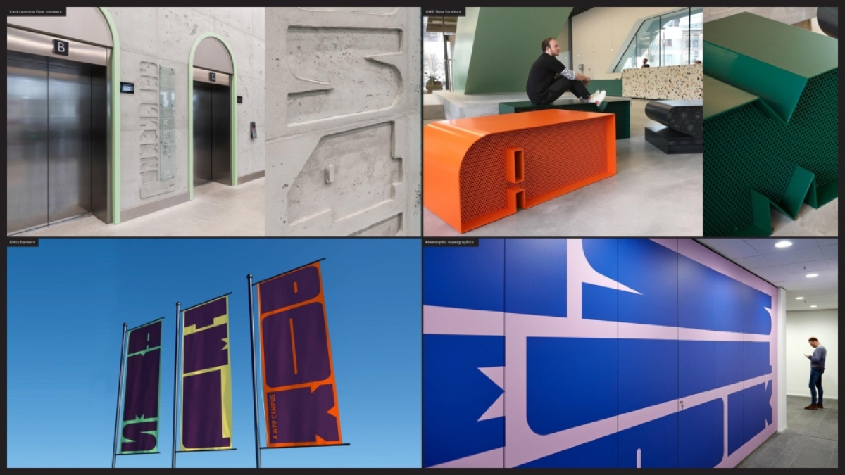
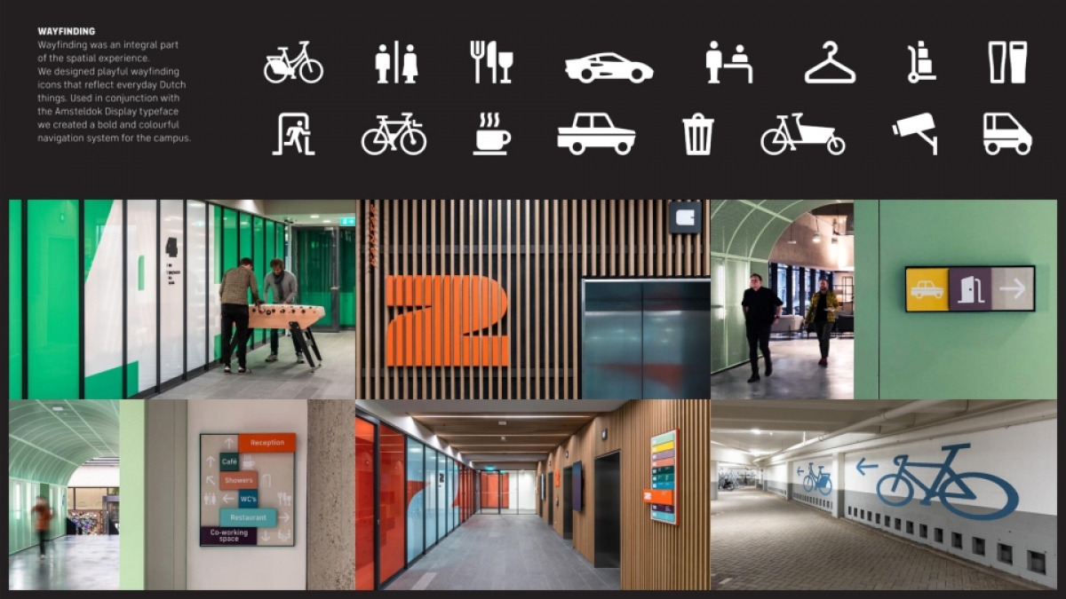
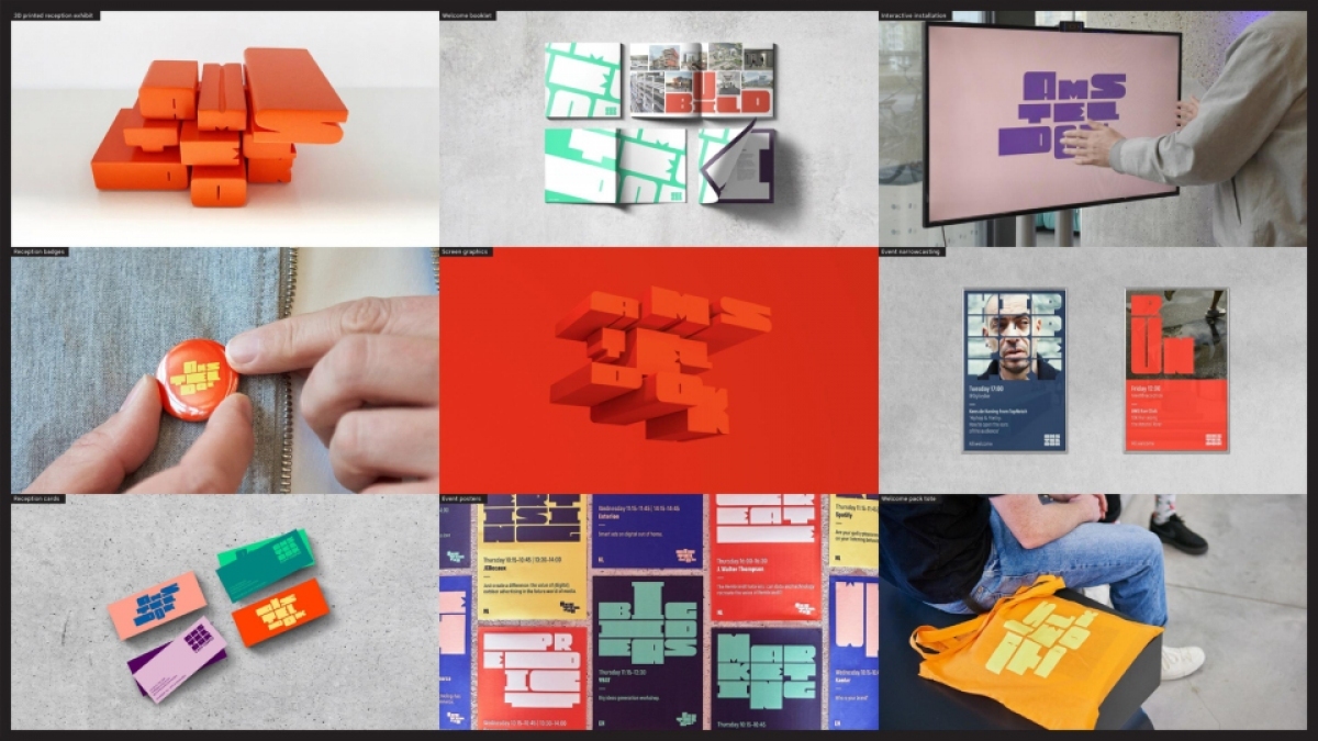
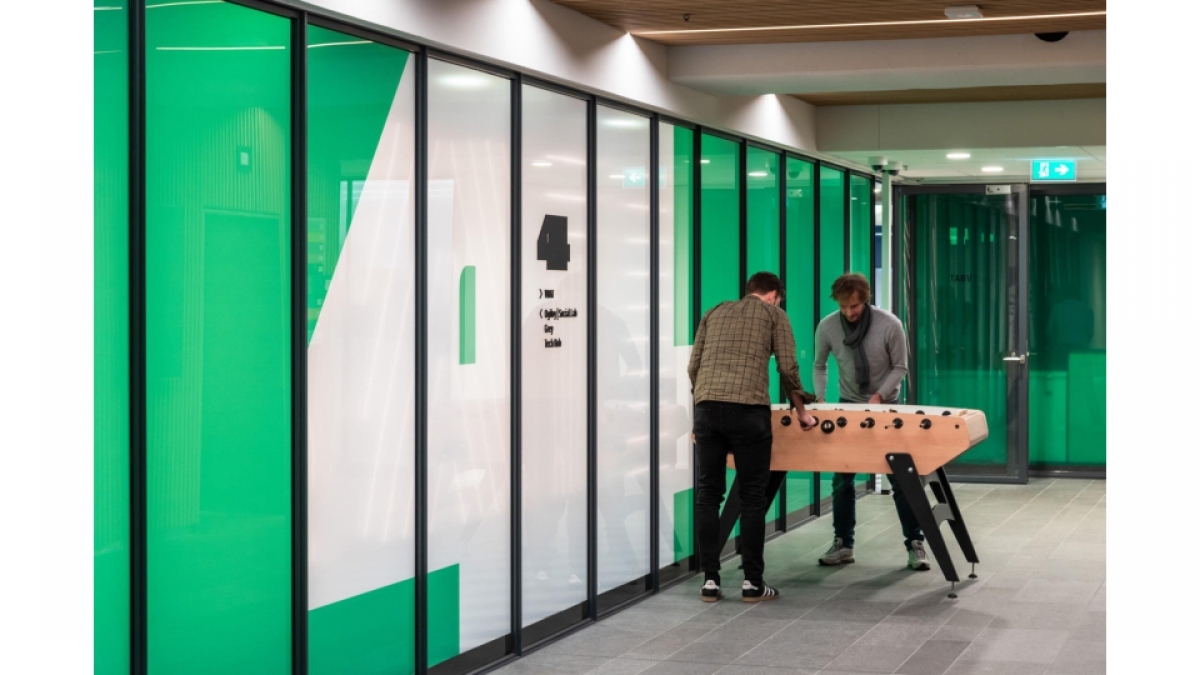
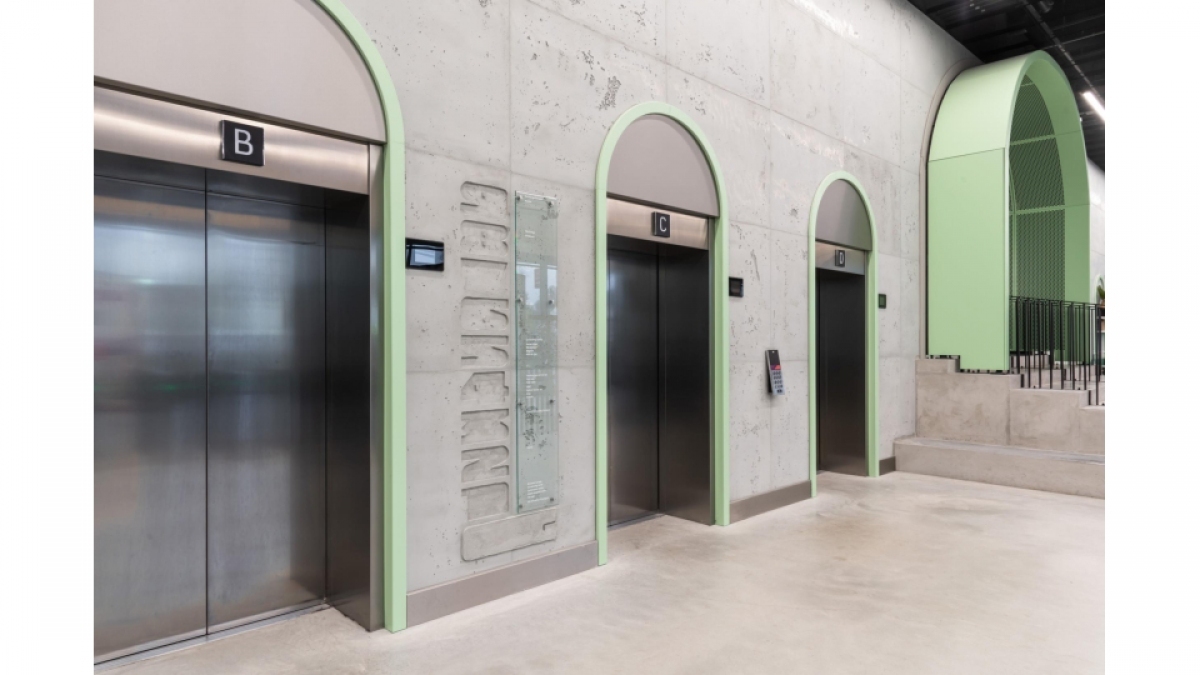
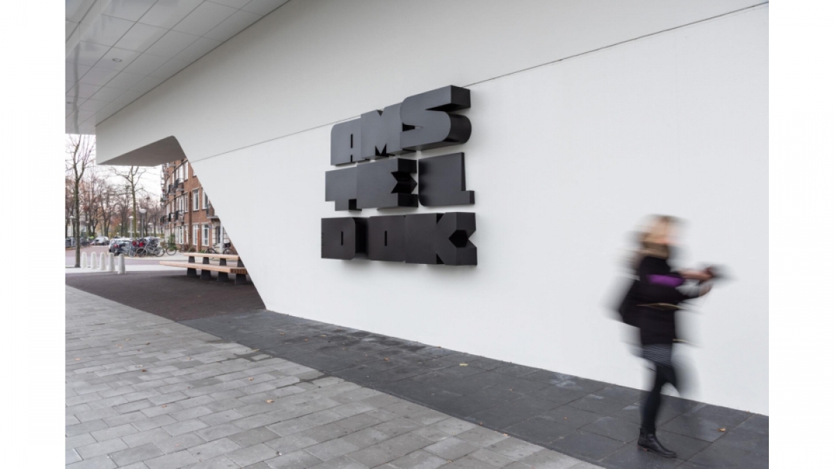
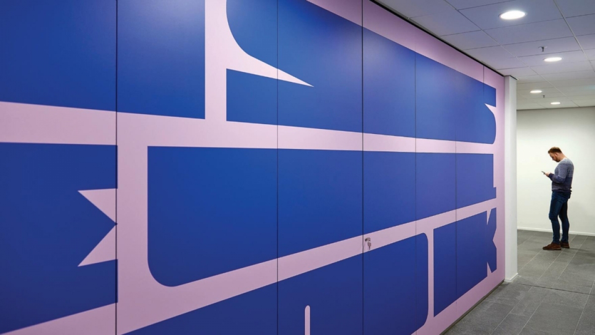
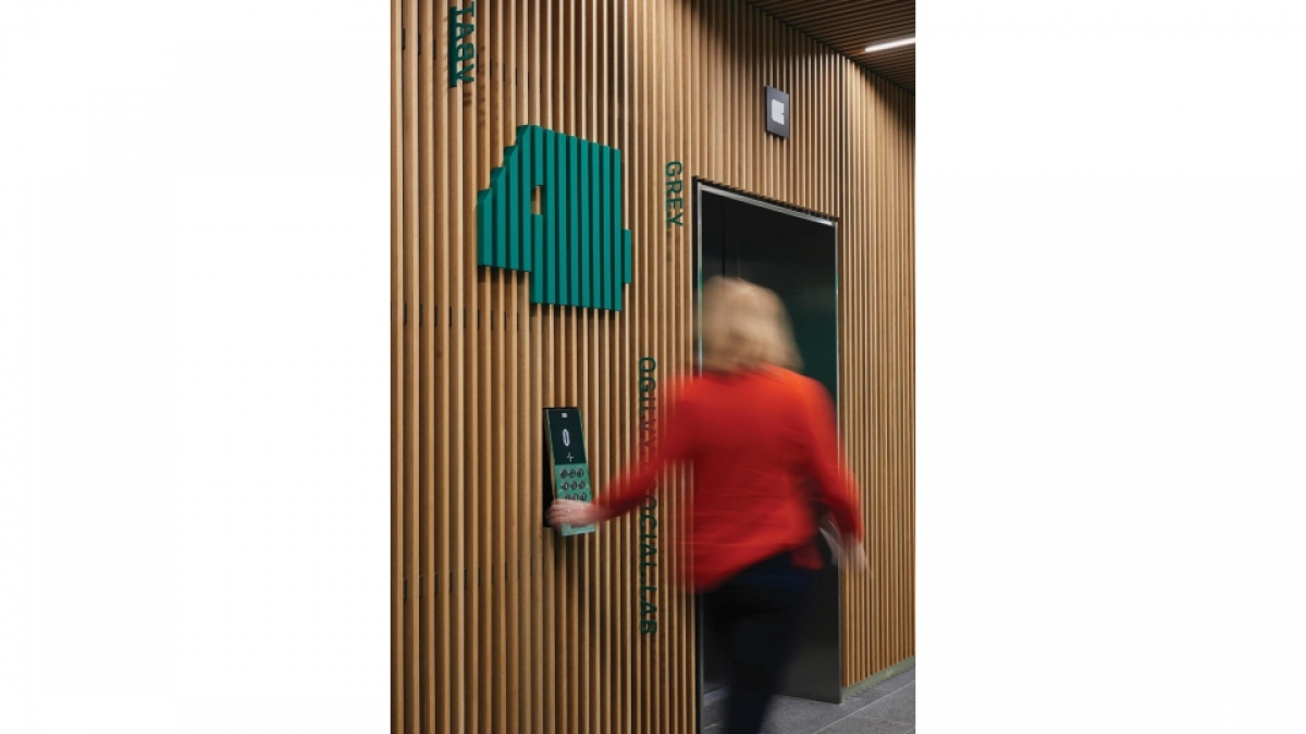
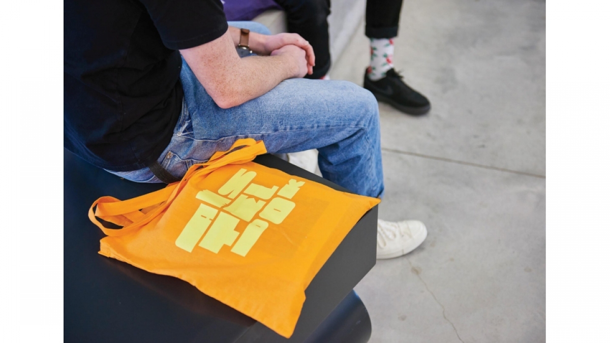
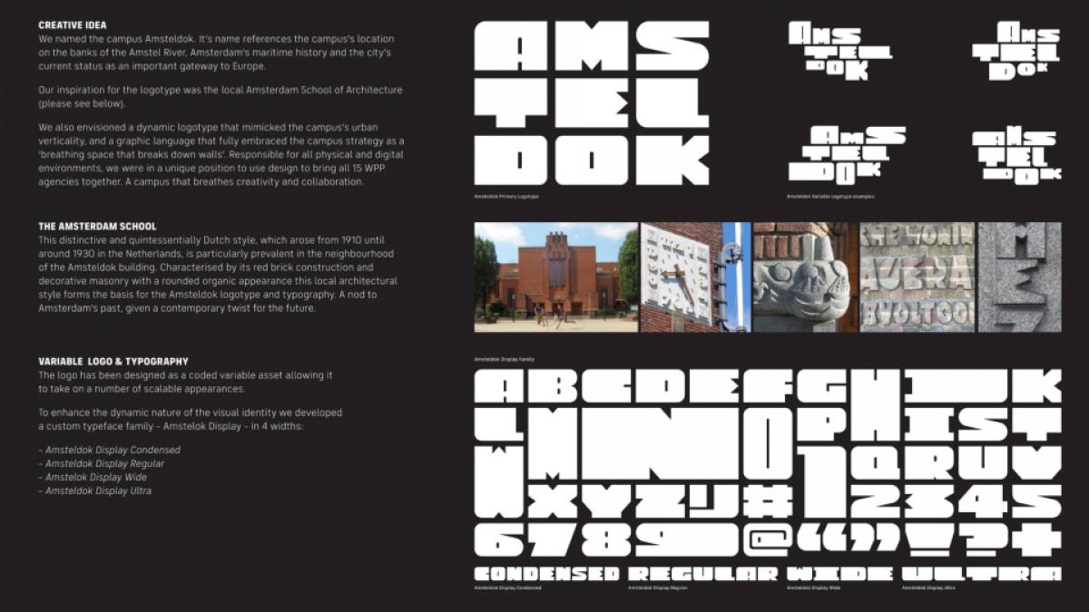
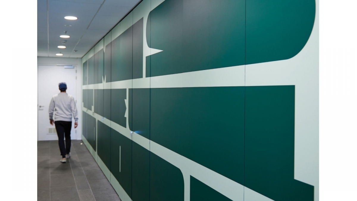
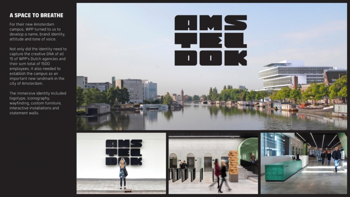
| Story | Creative idea We named the campus Amsteldok. It’s name references the campus’s location on the banks of the Amstel River, Amsterdam’s maritime history and the city’s current status as an important gateway to Europe. We wanted a logotype that was directly inspired by the physical structure and found the Amsterdam School of Architecture – an expressive 20th century style predominant throughout the city – an important inspiration for our typographic forms. We envisioned a dynamic logotype that mimicked the campus’s urban verticality, and a graphic language that fully embraced the campus strategy as a ‘breathing space that breaks down walls’. Responsible for all physical and digital environments, we were in a unique position to use design to bring all 15 WPP agencies together. Design would contribute to the campus as a living entity, not just another staid structure. A campus that breathes creativity and collaboration. Execution Like all signature Amsterdam School structures, we embedded the identity into the physical campus: tactile hero signage, typographic floor furniture, etched wall renderings, crafted directory totem and embossed counters. The logotype also functions as a template for all online/digital programming and communication – from digital posters, announcements and social events (speakers programs). The colour palette was also directly derived from the architectural materials used by the architects. Wayfinding was an integral part of the spatial experience. We designed playful wayfinding icons that reflect familiar Dutch things – bike icons that look like the ones you find on Amsterdam streets, glass icons in the shape of Heineken glasses, etc. All these elements contribute to a real campus identity and unite 15 radically different WPP agencies as a single whole. Results The campus now houses all 15 WPP Dutch agencies and 1500 people and has quickly become an Amsterdam landmark. On the opening day, the stock price of WPP reacted with a 5% increase within an hour, which equals a value of 500 million Pounds. Since opening, WPP Netherlands is invited for bigger pitches like never before. One undisclosed brand from China asked WPP NL to join the pitch as ‘WPP Campus Amsteldok’. Moving forward, WPP has already started to roll out this visual identity framework for all its WPP campuses worldwide. This year the design for the campus identity has received multiple awards including a shortlist at Cannes Design Lions. The opening of Amsteldok generated a large amount of earned media nationally and internationally in trade press and other important publications such as Het Financieel Dagblad, Adweek, BNR Nieuwsradio, Adformatie, Emerce, Underconsideration and many more. |
| Media Type | Corporate/Brand Identity |
| Martin Cadwallader | Design - Joe Faulding, Craig Berry, Harry Hobbs, Maarten van Disseldorp, Paul Bakker |
| Jason Smith, Pedro Arilla, Phil Garnham (Fontsmith) | Type design |
| John Lenehan, Chris Page, Anna Farrall (Acrylicize) | Implementation |

